DESIGNING FOR THE 2020 BOSTON ELECTION
During the 2020 election, we used our City brand to help bring trust and clarity to the voting process.
Getting people excited to vote during an election can be tough. That’s even more true at the height of a worldwide pandemic. When the Digital Team was tasked with helping the Election Department come up with some 2020 election designs, we jumped at the opportunity. By leaning on the City of Boston brand, we were able to get out simple, concise designs and messages to the public. We provided information that was friendly and easy-to-understand, all while remaining official.
STAYING SIX FEET APART
Social distancing was a critical part of staying safe in 2020 amid COVID-19. For that reason, Massachusetts offered mail-in voting to every registered voter in the state, including Boston. Along with early voting options available to voters, the goal was to help reduce crowding at polling locations on Election Day.
With so many voting options available in 2020, we had a few different design challenges, including:
- How do we ensure brand recognition across platforms and locations?
- How do we make the designs fun and inviting so that people want to interact with them?
- How do we make sure the designs are accessible to everyone in Boston?
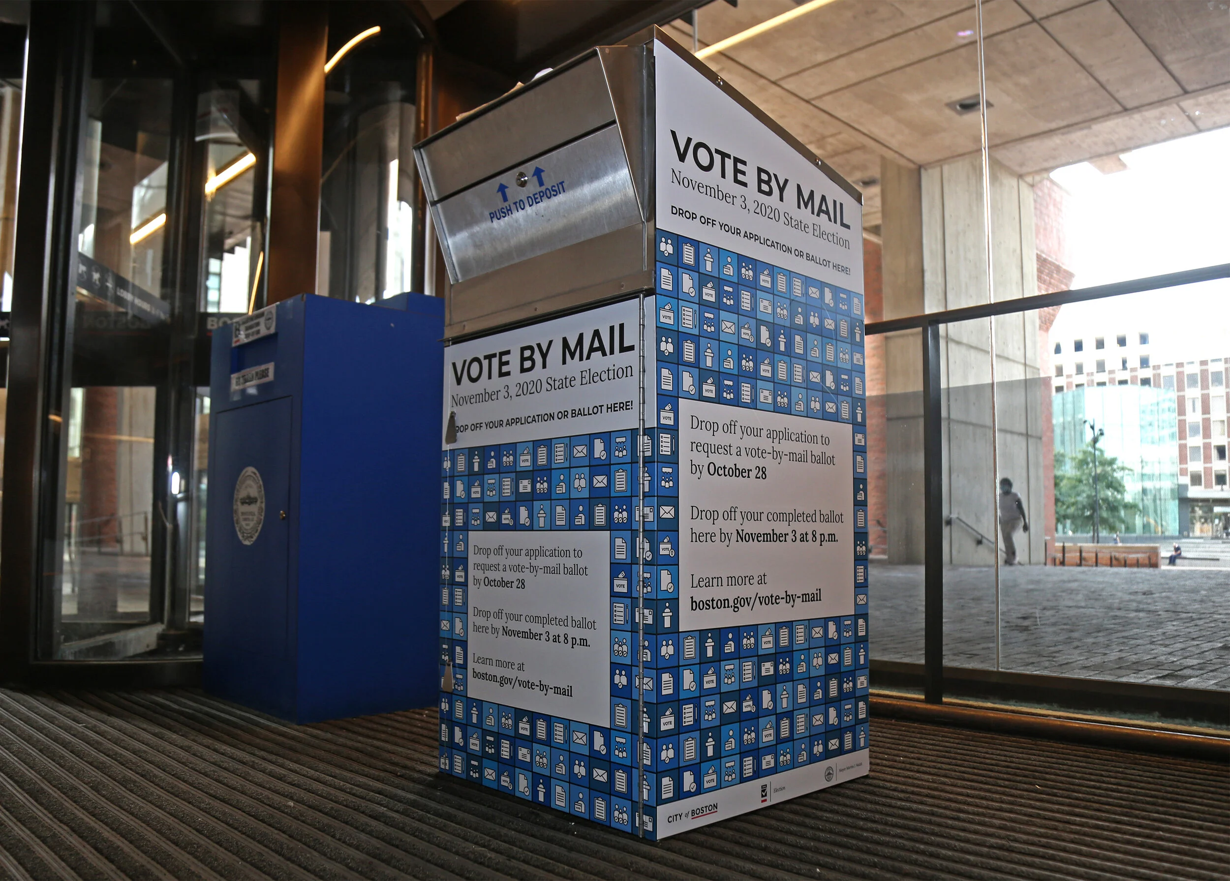
DESIGNING A BALLOT DROPBOX
Our first — and biggest — task was to design ballot dropboxes for mail-in ballots.
For the Presidential Election in November, 38% of ballots were cast by mail, 19% were cast early in person, and 43% were cast on Election Day in Boston.
During the election, a lot of folks who chose to use a mail-in ballot ended up feeling uncomfortable returning them by mail. There were concerns about ballots not making it back to our Election Department in time, and votes not being counted. To assuage those fears, the City provided dropboxes across Boston. With such an important physical asset that would be seen and used by many people, we had to design something that people felt comfortable with.
A quick image search for “ballot box” doesn’t return a lot of attractive results. Many of them look the same and have a lot of text on them. Our approach was to keep the design simple but informative.
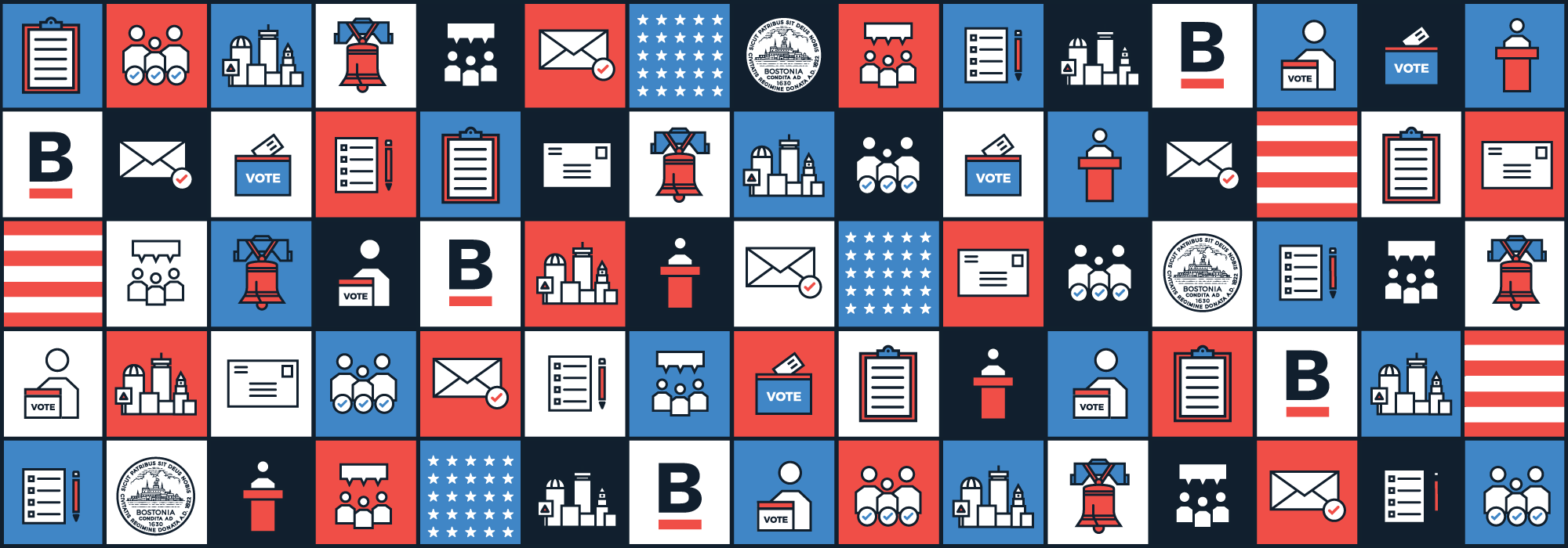
CREATING A MODULAR DESIGN
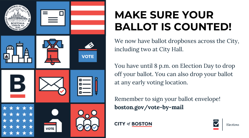
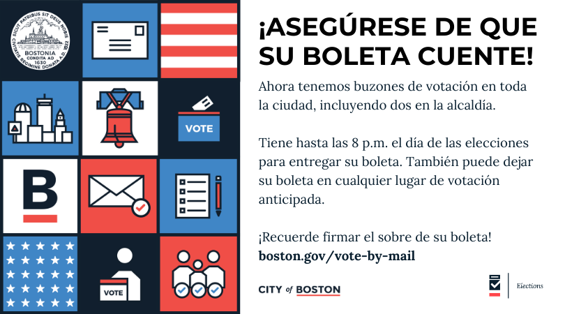
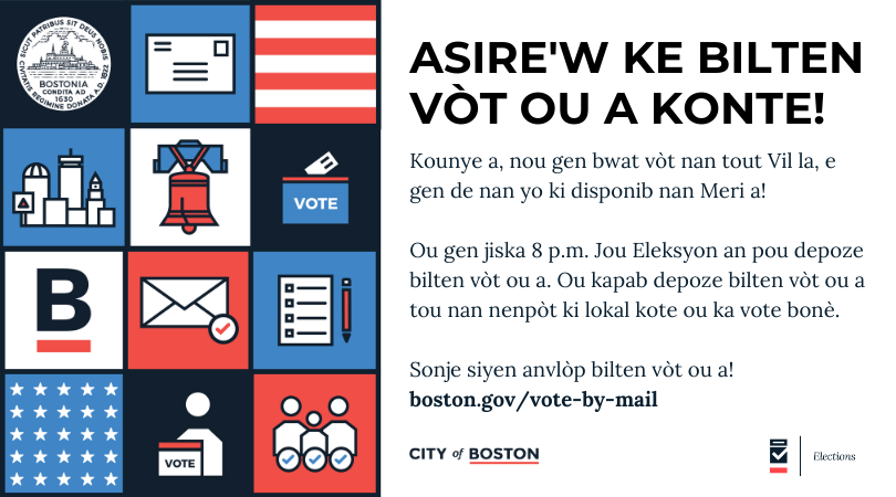
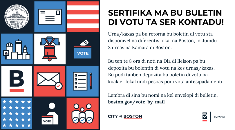
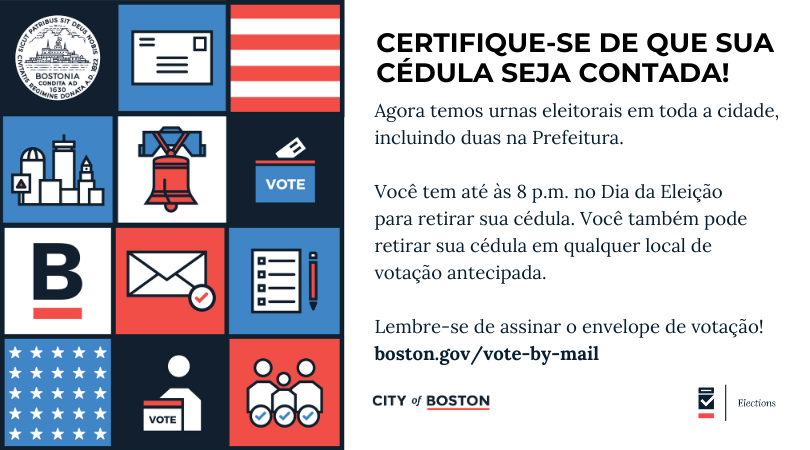
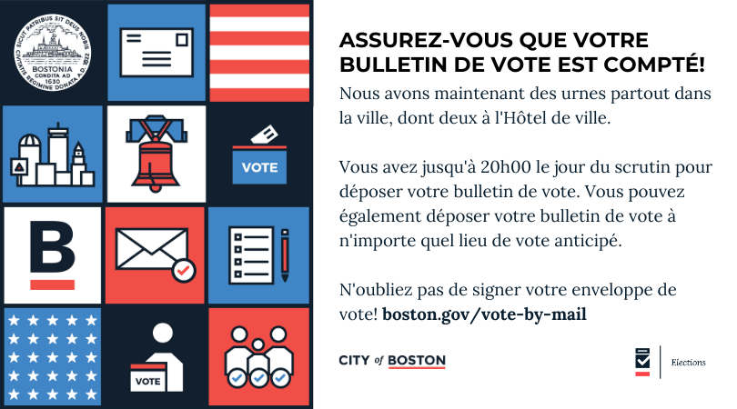
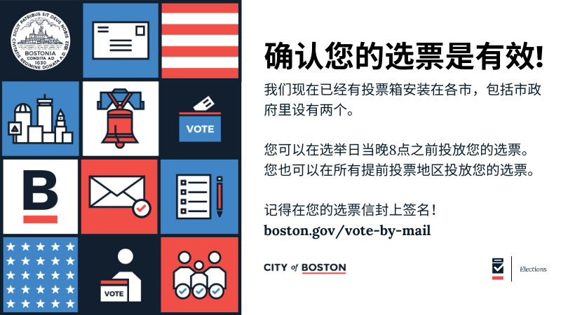
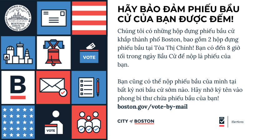
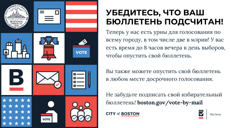
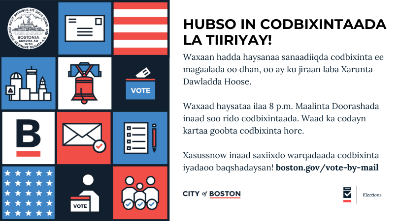
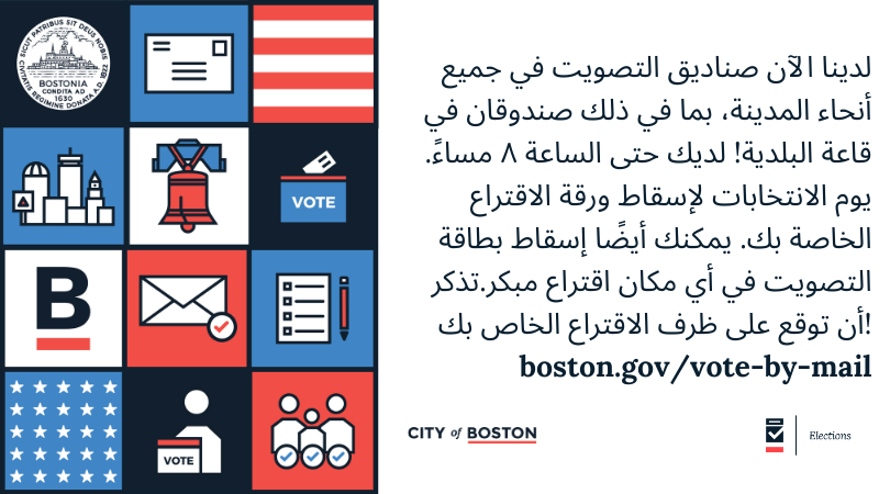
The only design prompt we got from the Election Department was to incorporate the colors red, white, and blue. We decided to make a square pattern with colorful boxes, that way the design could be easily transferred to other media assets. The text on the box, “Official City of Boston Ballot Dropbox”, was also translated into the top nine languages spoken in Boston to keep the information accessible to all residents. Taking the initial dropbox design as inspiration, we created social media graphics, website banners, printed material, branded videos, and more.
By including our brand colors, icons, and branded City logos, we ensured that the ballot dropboxes would be recognizable as official City of Boston assets. They were available 24 hours, seven days a week at 17 locations across Boston and were used by people all over the City. This dropbox design became a visual representation of the 2020 election, and democracy in action in Boston
2020 General Election ballot drop boxes

2020 Vote by mail ballot drop boxes
![9.17.20_Vote_Box_01[1].jpg](https://images.squarespace-cdn.com/content/v1/56e07296d51cd48341c99304/1603332055215-AK1HSGPWU5GL21TJ19DR/9.17.20_Vote_Box_01%5B1%5D.jpg)
Social media graphics
Including translations in the top ten languages spoken in Boston